The Prosperity Agenda
My Role
UX design, visual design for roadmap
Process
10 hours for research, ideation, sketching, and design
The Challenge
Help TPA redesign these kits to improve the overall user experience. We focused on one kit - the Heart and Brain Pack - with the assumption that our design solution can be applied to the other 7 and any future kits they may create.
Original Design
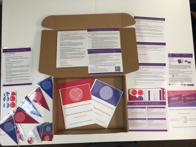
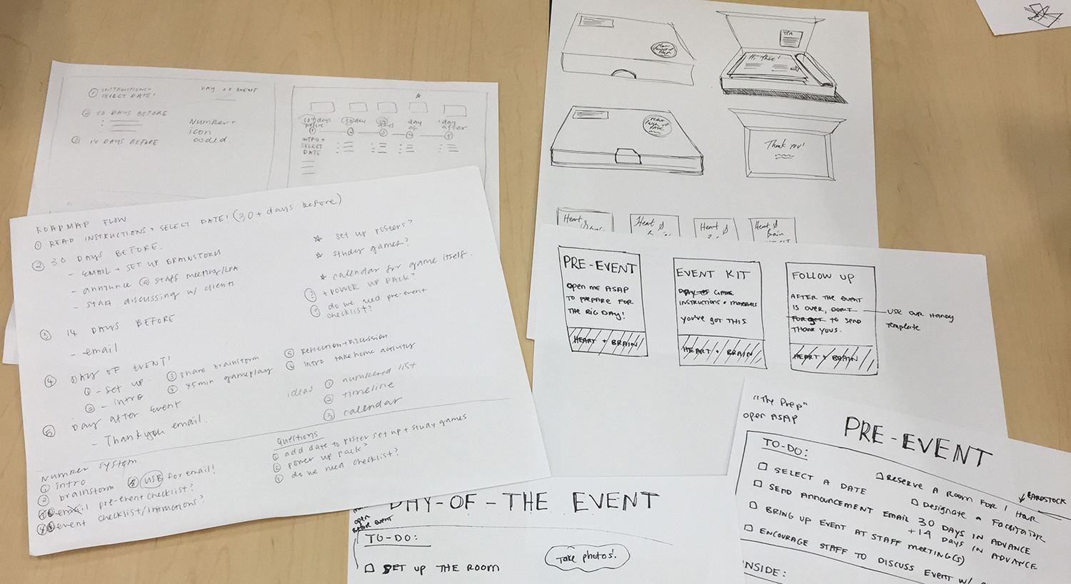
The materials are printed and assembled by TPA staff, and the boxes contain many loose sheets of paper, with no clear hierarchy of importance nor guidance in terms of where to start.
Our Strategy
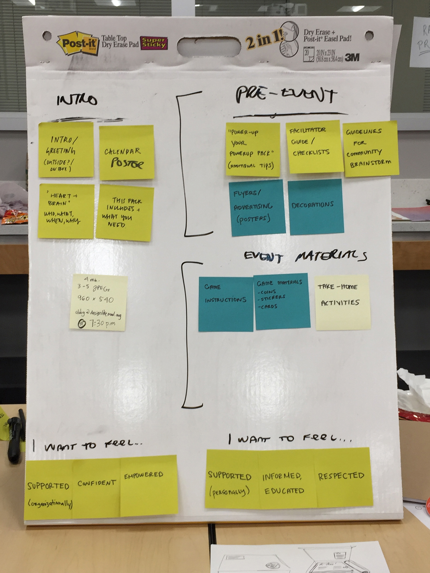
With only 10 hours, we started by understanding the problem, identifying the target users and the main pain points. Then, we created a strategy to target three areas that needed redesign.
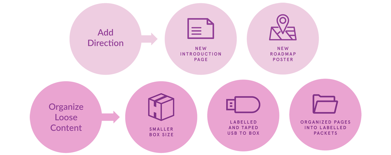
Packaging
Currently, the box is too big, and the materials are loose and separate. There is no direction of where to start and how the materials relate to one another.
Branding
The branding needs a clean and modern look that would be inviting and friendly. Facilitators need to feel empowered and families need to feel supported and excited.
Content Layout
The content layout needs to offer clear instructions to both the facilitators and families. The visual design needs to show more hierarchy of information.
Target Users

Facilitator
"I need the support and directions to help the parents of low-income families feel educated and informed about financial management."

Mother
"I want to be better prepared financially so I can take care of my family and educate them for a better future."
Process
After dividing our work into the three parts, we figured out how to organize the content using post-its and sketched new designs.
Solution
We collaboratively came up with the new experience and I designed the new roadmap poster. We started to redesign the content layout and branding but did not have enough time to finish that part.
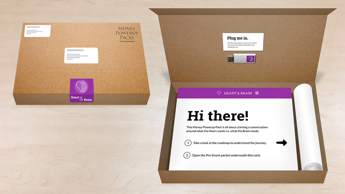
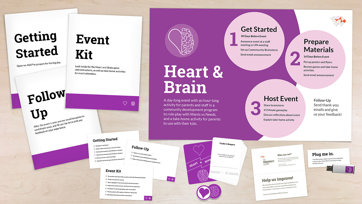
Packaging Design
Before you open the box, you see a sticker that shows you have the Heart and Brain kit. When you open the box, you see a new introduction page which shows you how to get started. On the right is the rolled up roadmap poster to give facilitators an overview of the process.
Inside the box
From top left to right: content packets, roadmap. From bottom left to right: checklists, game cards, feedback card, and USB.
What I learned
I learned about the tangible considerations that would affect user experience, such as how the box’s content should look like when it’s first opened, and how the size of the box should contain the contents. Designing the roadmap also taught me how to provide users with a clearer mental model in an experience.
Further Development
I would work on redesigning both the content layout and the content itself. I would strengthen the visual and packaging design to make the kit even more delightful to own, so that facilitators and families get more excited about its content. I would also test the kit with our target users, and would like to go beyond the packaging of a single pack and evaluate the entire Power Up Packs program.